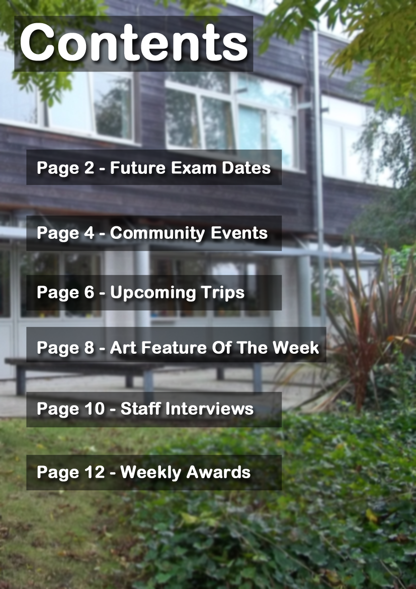
This is the contents page that I have produced for my preliminary task. It has been intentionally kept simple as its target audience is school students and their guardians, both of whom are unlikely to want to read vast amounts of content on school events likely not to be concerning them. As well as this, I have come to realise that these magazines are often produced by a member of staff (often an ICT teacher/technician, graphics teacher or the head teacher themselves) whom is often overworked and therefore has very limited amounts of time to put into the creation of these magazines. Therefore they commonly contain a small amount of pages, I would estimate that the average is somewhere below twenty, due to this I have only included twelve pages in my contents page. The subjects of these pages are mainly trivial as there is rarely anything of vast significant to be included in local school magazines.
This video shows the step by step construction process of the preliminary cover I have produced. The task was to produce a school magazine cover and contents page.
Front Cover:
Producing the cover:
Base Photograph -
The photograph which was selected to be used on the front cover was taken using a basic camera which was borrowed from the schools supplies. The model is a sixth form student and was selected due to his smartness and availability. Although I would have liked him to have looked slightly happier in the photograph, I believe that the picture I selected emphasises the seriousness of school but brings it to a more relatable level due to his youth and natural charm. The location in which I decided to take this photo was outside one of the schools main buildings. The contrast of the building and lush plant life displayed shows a connection between education and nature, thus bringing appeal to the magazine and boosting the image of the school.
Photograph Editing -
The photo I was left with was far from perfect and therefore required a lot of editing.
To begin with I blurred the background of the picture so as to draw the majority of the audience’s attention to the model and text.
Afterward I chose to airbrush out some minor features, these were the Nike logo on the models jacket (which was to avoid copyright infringement and unwanted product placement) and some undesirable facial features (spots, moles, etc). I was able to achieve this using Adobe Photoshop’s blur and clone tools (I would clone the texture of another part of the model, place it in a new area and then blur the edges to provide a seamless and professional looking effect).
The final step of the editing was colour correction. Using colour correction, I enhanced some of the more noticeable features of the model and was able to remove a few unnecessary shadows. The main changes were making the eyes a purer blue and bring more colour to the lips. Unfortunately I think that I overdid this, resulting in a lack of subtleness and therefore leaving the picture with some unrealistic features (eyes a slightly unnatural colour and lips which look as though they have had lipstick applied to them).
Final Touches -
To finish up, I added a title, text, barcode and the Schools logo.
I made the title (SGS Weekly, with SGS standing for St Gregory’s School) black and a large font size so as to provide contrast to the background. Adding to this, I gave it a yellow outline which draws attention and indicates that it is the name of the newspaper. Inspired by various other magazine layouts such as ‘Sugar’, ‘Q’, ‘Seventeen’ and ‘Karrang’ I placed the title at the top of the page, behind the model. After this I added the recommendation “Best Magazine in Kent” from an imaginary person named Dave, giving it the feel that it has been designed and reviewed by local talent. Furthermore, a brief list of the magazines features has been given (‘latest trips, exams time tables, event dates and much more’), a main feature (‘New Uniform!’) and an enticing competition for a £10 book voucher prize. Afterwards, the schools logo was placed in the bottom left corner of the page so as to give the magazine a branding and make it easily identifiable for the readers. The barcode was added to give the impression that the paper is authentic and is able to be commercially distributed. Errors -
After publishing this cover, I realised that I had made a few basic errors. These are as follows:
Spelling errors. In the list of features, I accidentally wrote ‘Events Dates’ instead of what I intended to write which was ‘Event Dates’. Despite the error being small and largely unnoticeable, the extra S lowers the magazines reputation as it gives the impression that the magazine will be riddled with spelling mistakes therefore lowering the overall enjoyment of the audience. This has since been corrected. The other error I made was over editing the facial feature to the extent of making them unrealistic.
This post shall show my very first attempt at creating a school magazine front cover. To create this cover I used a desktop publishing piece of software named 'CorelDRAW' and a modelling, animation and rendering package called 'Cinema 4D'.
This is the image which I used as a base for the cover. Unfortunately the quality of the image was not fantastic and the lighting in which it was taken was unsuitable for photography. I aim to improve this in my future work.
This is a 3D masthead that I designed in Cinema 4D. It looked nice by itself but I do not feel that it suits the magazine cover that I created. I will have to bear in mind that I need to create more subtle and more fitting mastheads in my upcoming projects.
This is the front cover I created as a first attempt. I am very unhappy with it and shall need to dramatically improve my skills with cameras and the computer software if I wish to create a professional, sellable looking final product. To do this I shall need to practise far more so and to watch many tutorials so as to boost my talent.
These are the pictures I took for the preliminary task. As is easily noticeable, very few were actually taken (eight in total). This was due to the limited time frame which we were given (during school hours between lessons) and unwillingness of students to have their pictures taken (I personally would have liked to have had at least thirty pictures to work with). Despite this, I believe that the pictures are of a good quality and will be more than satisfactory to use in the preliminary task (designing a front cover and contents page for a school magazine) due to the generic lack of professionalism in many available local magazines. Therefore I consider this photoshoot to have been a success.
This is a basic educational magazine I have found. The key sections of its layout have been labelled (the puff, masthead, plugs and cover lines) so as to show its simplicity and identify where they can be found on the page. The magazine itself is extremely simple and displays very little information on the cover, this is presumably because it a very small paper and very can only contain a limited amount of content. Adding to this, its target audience will be young children and their parents/guardians whom shall be unlikely to want to read an overly complex and large magazine. The photograph shown shows a group of students playing some sort of ball based game and represents the fact that the school is most likely a sporting specialist one, as indicated in by the main cover line ‘sports overview a successful year…’. The photograph seems to be of a high quality but contains either a minute amount of editing or none at all. However this is fitting for the genre as one would not expect such a thing for a magazine aimed solely at students and their guardians.