This video shows the separate stages of the construction process which I went through to create my final double page spread. The software used produce it was 'Adobe Photoshop Elements 8.0', 'Cinema 4D' and 'Corel Draw Graphics Suite'.

Showing posts with label Planning. Show all posts
Showing posts with label Planning. Show all posts
Sunday, 14 April 2013
Double Page Spread Construction Process Video
This video shows the separate stages of the construction process which I went through to create my final double page spread. The software used produce it was 'Adobe Photoshop Elements 8.0', 'Cinema 4D' and 'Corel Draw Graphics Suite'.

Contents Page Construction Process Video
Contents Page Before Feedback

This is what I have created so far for my magazines contents page. Personally I believe that it is the weakest of the three pieces I have created so far and will thus ask for people feedback on how it looks so far and how I could possibly improve it.
Saturday, 13 April 2013
Magazine Double Page Spread Text Content
Fresh from his series of five completely sold out gigs from his ‘Blitzkrieg in Berlin’ show hosted at the Olympic Stadium, Berlin, DJ Ennui discusses backstage life, music and his upcoming ‘Takeover Tour’ with our journalist Sonny Moore. Brace yourselves for the thrilling untold true story of the man behind the mask.
What started your passion for music?
I’ve had this passion for as long as I can remember. However, I think the spark that lit the fuse for my love of music was definitely the moment my father bought me a flute for Christmas.
A flute? EDM is quite the opposite, wouldn’t you agree?
Well it’s funny you should mention it – I had classical training for two years and I think the influences are clear in my early material as well as my more recent content. However I quickly became known as ‘Flute Boy’, and eager to shake the newfound identity, I used my pocket money to buy an early version of FL Studio and hence began to dabble in Electro Swing and EDM, purely to impress my friends, and to dispel the bullies. Soon my life revolved around the creation of electronic music, and I was soon scouted by the prestigious Mau5trap record label… but playing the flute is still my guilty pleasure!
That’s quite a story – how did you enter the live music scene?
You won’t believe this! I began by turning up to friend’s birthday parties with my Dell laptop and a shoddy speaker, and trying to blag girls with my music. I can tell you now that it didn’t work – I guess girls simply weren’t overwhelmed by my amateur beats and disappointing drops – however it allowed me to spread my music to a larger audience, gain publicity on MySpace, and receive the feedback I so desperately needed to improve my work. Soon after I applied for larger venues in my local area on Friday nights, and became a local sensation.
Do they compare at all to the monstrous five gigs you have just played in Berlin?
Certainly not! However nothing can compare to that one night in a dimly lit Brixton chip shop… But we’ll not delve into that.
So, why conceal your face to the public?
Quite honestly, I don’t believe I have the answer to that question – it’s just the way things turned out – on the other hand, it certainly has its perks.
And what would those perks be?
I simply feel that it gives me so much freedom because I am able to live a double life – one of peace and tranquillity, and another of parties and publicity. For me, I maintain a perfect balance of the two. For example, I can dedicate time to my Chelsea Pensioners extreme bingo club with relative anonymity, while retaining my reputation as a global party animal. It’s truly unbelievable. If you are struggling to visualise my lifestyle, I would strongly recommend watching ‘Hannah Montana’ on the Disney Channel.
Simply amazing! Let’s discuss your upcoming global ‘Takeover Tour’
Ah yes, I am touring exactly thirty two separate countries in six continents (Sorry, Antarctica), but personally I am most excited about the Gulf of Mexico section of the tour, as it involves a world exclusive two day long aircraft carrier gig between Mexico and America, and although I regret to give away no spoilers, my entry to the gig will be ‘pure gold’, as they say.
And will you be visiting the UK during your tour?
Why of course, how could I miss it? As well as being my home country of course, it is also my favourite place to gig, and in addition I am scheduled to be granted a knighthood the day of my O2 Arena gig!
Wow, we all look forward to it! And when will tickets be available?
Tickets are available from midnight, April 1st 2013 to May 20th, however I would advise ordering as early as possible since my last tour sold out completely literally minutes after the tickets became purchasable!
Thank you so much for talking to us, DJ Ennui. Make sure to pick up a copy of his new album, ‘Balloon Party’, on sale everywhere right now, and also continue on to page 32-33 for info about specific venues, dates and support acts for the gargantuan global ‘Takeover Tour’, as well as exclusive content with the hottest EDM acts on the scene TODAY.
Double Page Spread Layout Plan And Research

(click to enlarge)


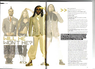


This is my layout plan for the double page spread. Although it looks simple and generic I believe that it will provide me with a fantastic, professional looking product. It is largely inspired by a variety of different existing content.
These are the main sources of my inspiration for this design:

The key features that I shall use from this magazine are the large quotes, position of the main picture and the separation of the title and short introduction paragraph.

My favourite feature in this double page spread is their title 'Slave to the rhythm' and its variation in size and positioning ('Slave' being far larger in size than 'to the rhythm' but taking up a similar width of the page). I am very likely to include a title similar this in my final double page spread. However, I am not to keen on their choice to place the story on the left hand side and the image on the right.

The verity of size and shape in the quote particularly draws my attention. I am unlikely to use something like this, but it certainly stands out and would therefore be worth experimenting with.

I admire the choice to continue the image from the first page onto the second. I will definitely use this tactic when producing my own double page spread. Another of the features I am considering is the large letter at the beginning of the story that uses a different font type to the rest of the text. In addition to this, the choice to use a blank background for the model is particularly interesting and is another feature which I am taking into consideration.

This is clearly a very professional magazine and I approve of the layout. However I hate the oversized, red L they have placed behind the text. I believe that it will detract the attention of the reader and generally causes a somewhat ugly and undesirable effect.

This cover looks very unprofessional due to the dark colours used and the bland expressions on the models. Despite this, I feel that that their layout of the text is very good therefore improving the feel of these pages dramatically.

The large quotes and continuation of the picture onto both pages are exceptionally good. However I am concerned that using such a small amount of text for the main story would reduce the quality of my double page spread.

The clear picture, large quote and clean layout are all very positive features of this example. The only thing which do not approve of is the image used in the top right section as I believe it was an unnecessary use of space; this space could have been used for an extra amount of article.

This example has a very nice picture. Unfortunately, the black boxes behind the text severely lessen the professionalism of this double page spread.
Contents Page Layout Plan And Research

(click to enlarge)


This is my layout plan for the contents page that I am creating. I intend to make it look like a slight cross between a traditional contents page and a promotional poster for a festival. This I believe is a very unique and original idea, however it shall be very difficult for me to pull off successfully. Although if I am able to do what I intend to then I feel that the result will be wonderful, as well as establishing a strong connect between the magazine and various festival attendees . In order to even attempt to do such a thing I have been looking through a variety of different contents pages and festival posters.
These are a few of them:

This is contents page from a 'Glamor' magazine. It is very reflective of my intended design as it has a very large title and date at the top of the page. As well as this, I like the idea of repeating the magazine's name in the contents page so as to reinforce the brand identity. The picture of the woman used is very good as well. However I do not intend to have a single large image, instead I will have a variety of pictures all with quotes and brief summaries of their own.

My favourite feature of this contents page is the large bold text used for the different sections of the magazine (in this example they are: news, radar, reviews, live!, features). I will definitely be using a sizeable font for my section dividers.

I love this design. It is likely that final product shall be of a similar feel to this, but have fewer pictures and feature a greater amount of featured pages. In addition to this, I do intend to place any adverts in my contents page as I believe it will waste space and give it a feeling of cheapness and a lack of professionalism.

The feature that seems most appealing to me in this magazine is the use of page numbers over the featured photographs. I intend to use this tactic in my final product but use a font and style similar to that of my front cover so as to give it a consistent feel.

I have already shown a NME contents page but I feel that this one gives a very different feel to the previous one. This has been done via the change in colour palette, difference of page heading and photographs used. The previous contents page had a very serious 'rock' music theme, but this one seems far more light-hearted and festive themed. I will need to remember that these variations can be made, if I am ever to produce another one of these magazines.

This is a promotional poster for the 'Global Gathering' festival. Although its fonts are far to varied to be used in a contents page I particularly like how they've created the page heading. I am likely to try to replicate the feeling of this heading in my final contents page.

This is the promotional poster for the 2012 'Download' festival in Donington. As I mentioned in the example above, I am very interested in producing a title similar to those seen in festival posters.

Here is the promotional poster for the 'Wireless' festival 2013 in London. I admire how they have set out their line up sections and am likely to attempt to replicate this when creating my different sections (e.g. interviews, reviews, festivals).
Front Cover Construction Process Video
This video shows the separate stages of the construction process which I went through to create my final front cover. The software used produce it was 'Adobe Photoshop Elements 8.0', 'Cinema 4D' and 'Corel Draw Graphics Suite'.
What can be seen in the video (in order):
1) The original photo which was used to produce the cover
2) The background has been cut out of the picture
3) Abstract 3D shape used to obscure the models face
4) Shade and background images added
5) Visual effects applied (smoke, fire, sparks, cracks and flare)
6) 3D masthead added at top of page
7) Custom made splatter effect and overlay for the title applied
8) 3D main cover line text placed over splatter effect
9) Strapline, Cover lines, Puff and other text added
10) Barcode with price, date, issue and fake copyright information placed
Friday, 12 April 2013
Front Cover Before Feedback

This is what I have created so far. Before releasing the final version of my front cover I shall be asking for peoples opinions on my magazine and whether or not it needs improvement.
Thursday, 11 April 2013
Software Practise
Audience Survey
To determine what I should include and focus on in my magazine's font cover, contents page and double page spread I created a survey with the website 'SurveyMonkey' (website link: http://www.surveymonkey.com/). I used this method so that I would be able to instantly distribute it to many people virtually, thus saving time and paper by doing so as well being able to reach a far larger amount of people than I would have been able to by going around and doing it physically. The reason I created the survey was to give me an insight into various properties of an audience. The questions asked were:
Male
Female
The reason these were asked was so that I would be able to craft my magazine to better suit the audience and their desires, as well as identifying whether or not I should include some features such as a website link and allow me to make small changes like changing the sale price.
Here is screenshot of the survey that I sent out:

Male (18 males)
Female (12 females)
These results most importantly show that I should price my magazine between £1.01 and £2.00 (I shall probably set its price to £1.99), that I should add a website link and that the main focus of my magazine should be on the EDM genre of music.
1) What is your gender?
Male
Female
2) How old are you?
0-12
13-20
21-30
31-40
41+
3) How often do you buy music magazines?
Never
Very rarely (once or twice a year)
Occasionally (monthly)
Often (weekly)
4) How much would you spent on a music magazine?
Nothing
£0.01 - £1.00
£1.01 - £2.00
£2.01 - £3.00
£3.01+
5) Do you ever read music magazines via computer or mobile phone?
No
Yes
6) Do you ever listen to electronic music?
Yes
No
No
7) What is your favourite genre of electronic music?
Dubstep
EDM
Trance
Drum and Bass
Electro
Electro
Speedcore
I do not listen to electronic music

After sending out my survey (I mostly sent it to people I have listed as 'friends' on Facebook, and to people I have added in my email contact list) until I had thirty responses I was left with these results (number of results in brackets):
1) What is your gender?
Male (18 males)
Female (12 females)
2) How old are you?
0-12 (0)
13-20 (27)
21-30 (2)
31-40 (0)
41+ (1)
3) How often do you buy music magazines?
Never (5)
Very rarely (once or twice a year) (11)
Occasionally (monthly) (8)
Often (weekly) (6)
4) How much would you spent on a music magazine?
Nothing (3)
£0.01 - £1.00 (7)
£1.01 - £2.00 (14)
£2.01 - £3.00 (6)
£3.01+ (0)
5) Do you ever read music magazines via computer or mobile phone?
No (19)
Yes (11)
6) Do you ever listen to electronic music?
Yes (21)
No (9)
No (9)
7) What is your favourite genre of electronic music?
Dubstep (4)
EDM (8)
Trance (1)
Drum and Bass (6)
Electro (2)
Electro (2)
Speedcore (0)
I do not listen to electronic music (9)
Wednesday, 10 April 2013
Fourth Photoshoot
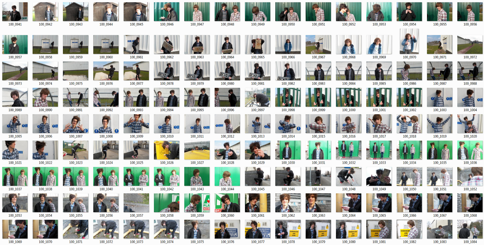

These are the pictures which I took for my fourth photoshoot. These pictures were taken in an outside environment using a high quality camera. The natural lighting (the natural light provided a far better contrast effect than the pictures I had taken inside buildings) and backdrops provided me with excellence results and allowed me to capture clear and professional looking results. This time I was able to take many photographs and capture an extremely wide verity of poses, which will be extremely useful for creating my contents page and double page spread. With a bit of editing, I truly believe that some of these pictures shall provide me the opportunity to make a truly fantastic looking final product for my magazine.
These are some of my personal favourites taken in this photoshoot:

(nice artistic looking lighting on the model)

(model's face is hidden thus adding emphasis to my choice in the front cover to hide his face)

(distant and vague looking expression, may be seen as artistic or 'indie' to some)

(shows two band members posing and looking serious)

(high quality photograph that looks as though it would be suitable for use as an album cover)

(innocent and likeable appearance of model, added to by the heart shaped piece of graffiti)

(action shot of jump pose, shows passion and celebration)

(stylish and unique pose, also showing similar clothing to 'Daft Punk')
Sunday, 7 April 2013
Front Cover Mock Up

(front cover mock up)

(original image)
‘Ephemera’ is the title I have chosen for my magazine, the definition of it is as follows: Things that exist or are used or enjoyed for only a short time. I find chose this title as it has a deep meaning behind it, as well as being witty and original (implying that attention to a specific media is often shortly lived due to rapidly changing technology and institutions). The title is reflected in the model via the use of gestures towards a broken clock. It also seemed far more fitting than any of the others that I came up with and received the largest amount of votes in my survey (see previous posts).
My image is inspired by the vastly popular 1964 painting ‘The Son of Man’ by the Belgian surrealist painter René Magritte. His summary of the painting was as follows:
“At least it hides the face partly. Well, so you have the apparent face, the apple, hiding the visible but hidden, the face of the person. It's something that happens constantly. Everything we see hides another thing, we always want to see what is hidden by what we see. There is an interest in that which is hidden and which the visible does not show us. This interest can take the form of a quite intense feeling, a sort of conflict, one might say, between the visible that is hidden and the visible that is present.”
I believe that my image replicates these intense feelings of which Magritte described, thus bringing the audience a greater appreciation and vast desire to read my magazine. It also appeals to art appreciators and those whom are familiar with the pop culture, expanding the reach that my content has across various different audiences.
.jpg)
('The Son of Man' Painting)
I was also inspired however by the many masked musicians such as Deadmau5, Daft Punk, Slipknot and The Bloodly Beetroots (see previous posts for more information). I believe that hiding my models face is a positive feature as it allows audiences to focus purely on the music and not of that of the musicians personal identity. As well as this, it allows the person whom has their face hidden to create a new identity for themselves and allows them to truly express their feelings without ever fully revealing their physic features.
As quoted by the fictional protagonist in V for Vendetta:
“There is a face beneath this mask, but it isn't me. I'm no more that face than I am the muscles beneath it, or the bones beneath that.”

('V for Vendetta' comic cover)
Saturday, 6 April 2013
Improved Front Cover Layout Plan And Research

(click to enlarge)
These are the main cover designs which I was inspired by:

Has a really nice range of cover lines, good positioning of the models and an interesting barcode. However, I feel that it lets itself down due to the excessive use of large text over the models. I think the main feature that I shall be using from this magazine is the barcode layout, as it includes the price, release date, website and correct barcode type. I shall need some research to find out what barcode type they have used (generic barcode style but with an additional shortened barcode type at the end which contains two digits and a '>' sign)and then I will create my own using a custom barcode making website.

This is not a professional magazine as such (is not sold anywhere, instead it was created for somebody's portfolio: click here to visit site). However, I believe it contains all the necessary vital elements and looks extremely good. The main elements I shall be using from this magazine are the positioning of the model and main cover line.

This magazine design is my personal favourite. The hiding of the models identity via the mask is a vastly desirable feature and I certainly aim to produce something of a similar sort. In addition to this, the text is not overly cluttered like in most magazines and gets straight to the point via their main cover line (the theme of 'Dance Madness'). Finally, the background has been removed from the photograph thus giving a more simplistic and professional feel to the magazine.

The use of a 3D shattering effect is particularly interesting to me as I am considering using a 3D font for my masthead. By doing so it will provide me with a completely unique cover, however it will going against the traditional magazine conventions as has been done in this cover of 'Q'. As well as this, I admire the humorous quote 'I bought 50 cans of beans and an axe'. It is rather bizarre quote but it provides a good hook and is therefore likely to attract more of an audience.
Friday, 5 April 2013
Dj Ennui Text Creation
This is a video that I have made showing the creation process of my main cover line. The video itself was recorded using 'Camtasia Studio 7' and has been vastly sped up so as to prevent a lack of interest. The software used in the video is 'Cinema 4D', the renders I have made will be used in my final front cover.
These are the rendered images that can be seen in the video:


Though there is very little visible change I have rendered them in a variety of different angles so that I have a selection of different images to choose from and produce the best result with.
Wednesday, 27 March 2013
Abstract Shape Creation
This video shows the process through which I went to produce a verity of abstract shapes for use in my final covers background and to mask the models face. The video is vastly sped up so as to prevent any boredom and provide a full insight into the creation of my magazine features. To create these, I used 'Cinema 4D' and a plugin called 'Thrausi'.
Here are some of the renders that I produced:


Subscribe to:
Posts (Atom)