Wednesday 27 February 2013

Electronic Music

Electronic music is music created via the use of technology (such as DJ decks and software e.g. Fl Studio, Logic Pro and Avid Pro Tools) and electronic musical instruments (such as keyboards). It has become increasingly popular due to the lowering prices and availability of technology (from the late 1960s), uniqueness and its huge variety of subgenres (both popular and experimental). Its main beginnings were in nightclubs around the 1980s, the early DJs provided their audiences with a completely new and original form of music. Over the years it has progressively expanded and developed. Now software exists which provides users with everything they need to their own original content, DJs have the power to draw in vast crowds of listeners, live performances are becoming increasingly impressive (the more popular musicians tend to have huge custom build stages fully equipped with their own screens and LED lighting) and the songs are becoming more creative and experimental than ever before.

One of the most recent genres to be created is Dubstep. The earliest Dubstep releases appeared during the late 90s and were often only experimental one-offs or bonus tracks.

‘Dubstep rhythms are usually syncopated, and often shuffled or incorporating tuplets. The tempo is nearly always in the range of 138–142 beats per minute, with a clap or snare usually inserted every third beat in a bar.’ (Wikipedia quote).

In 2011 dubstep became vastly popularised in the USA due to the Dj known as ‘Skrillex’ and his EPs ‘My Name is Skrillex’ and ‘Scary Monsters and Nice Sprites’. Since then many more artists have begun experimenting with the genre, however Skrillex has remained the icon most commonly associated with the music style.

Most electronic songs have very few lyrics, if any at all, and often sample many of their sounds from other musicians content. Instead of the focus being primarily on the lyrics of a song, the artists tends to provide people with a range of exiting and varying sections to stir up a variety of emotions (much like the famous classical composers  Mozart and Beethoven).

The variety of different electronic music genres is enormous. To name a few:

House, Disco, EDM, Trance, Dubstep, Drum and Bass, Electro Swing, Acid House, Eurodance, Glitchstep, Chiptune, Bleep Techno, Jumpstyle, Raggacore, Rave, Speedcore and many more (for a large list of the genres: click this link).

Here are a some electronic songs:

 Pegboard Nerds ft. Splitbreed - We Are One:


Caravan Palace - Clash:


Deadmau5 - Some Chords:


Skrillex - Scary Monsters And Nice Sprites:


The Quick Brown Fox - DAS LOVE BOP:


Initial Intentions


My intention for the music magazine that I aim to make is to focus on electronic music.

Why electronic music?
I plan to base my magazine around this because it is my personal favourite type of music, and therefore I have more knowledge and experience on the subject. This should make the task far easier for me as I shall be using an area of interest and passion, which I ought to be able to write a lot about and produce better graphics for the creation sections.

In addition, I aim target people of a similar age to me (teenagers and young adults) as I am better suited to producing content for them than any other age category.


Tuesday 26 February 2013

Magazine Conventions - Layout

These images show various different magazines. I have labelled the key features of their layouts so as to provide me with inspiration and help for when I create my own. A basic front cover will  often contain a masthead, puff, plug, cover lines, a main cover line, strapline and a barcode. I aim to include as many of these as possible in my final front cover design.

(labelled 'Sugar' magazine)


(labelled 'Q' magazine)


(labelled 'Kerrang' magazine)


(labelled 'Vibe' magazine)


Monday 25 February 2013

'Sugar' Magazine Analysis


Sugar Magazine Analysis

Sugar Cover Analysis The magazine ‘Sugar’ is aimed at teenage girls and focuses mainly on lifestyle. Its publisher ‘Attic Futuna’ is locked in a furiously competitive market and must constantly strive to make their magazine more appealing and thus more sellable. In order to do this, ‘Sugar’ has to stand out from other magazines such as ‘Q’ and Emap’s ‘Bliss’. To draw in more readers, the front cover uses bright contrasting colours and ironic subheadings such as ‘What every girl needs to know about snogging’ (This particular subheading appears to be aimed at hugely stereotypical heterosexual teenage females). The cover line’s promise to ‘get kissing confident’ places emphasis on the fact that it is aiming to attract a younger audience as it appears to be suggesting that readers have either never kissed anybody or are still lacking confidence when doing so, therefore we can draw the conclusion that those lacking ‘kissing experience’ are likely to be twenty five years old or younger. To make the cover line more interesting for readers, different font sizes are used for each word (‘Get’ is located above the other two words and uses the smallest font of the three, ‘kissing’ is located just below ‘get’ and has the largest font size and ‘confident’ is below ‘kissing’ and is in a slightly smaller font) and yellow is used to clearly stand out against the model and bright pink background. Emphases is placed on ‘kissing’ and ‘confident’ as they are seen as being desirable aspects of modern culture and are therefore likely to increase the likelihood of people purchasing the magazine thus benefiting the company responsible for the ‘Sugar’ magazine (‘Attic Futuna’).

The magazine's title ‘Sugar’ is easily identifiable for regular readers as the fonts size and position is the same for every issue, with the only differences between issues being the colour, texture and whether it is located behind the model or not. Above of title on this cover is a short piece of text advertising a contest and Sugar’s website ‘Win £500 on sugarmagazine.co.uk’. The £500 prize money will intrigue the audience and is likely to draw in buyers of the magazine and people whom have simply seen the magazine cover on the shelves of shops, therefore bringing in new readers and making regulars feel rewarded for their interest in ‘Sugar’. This particular cover also takes advantage of the male gaze via the use of an ‘attractive’ model and the subheading ‘Anna Hathaway “Secretly, I’m really a bad girl”’. The sexual connotations of ‘bad girl’ appeal to males and are therefore likely to increase sales of the magazine as males shall purchasing it to see how exactly the model is a ‘bad girl’. The image of this model is conventional for the genre of magazine as she is older than the target audience and is likely to be seen as a role model. Her confident and inviting smile is likely to reinforce the idea that the magazine is aiming to be a friendly and something that audiences may relate to. In addition to this, she provides a great contrast to the plain pink background and makes the magazine feel more appealing and professional.


Sunday 24 February 2013

‘Q’ Magazine Analysis


Q Magazine Analysis

To begin this analysis, the masthead is a large simple ‘Q’ which is white and therefore stands out against the red square which it is placed in. It is in the top left of the page, thus allowing readers to easily identify that it is a ‘Q’ magazine. Underneath ‘Q’ it says ‘a different take on music’ in a smaller and different font. The reason behind the positioning of the masthead (located in the top left of the page) is that English is read from left to right; therefore in theory ‘Q’ should be the first thing that is read by the audience. Normal mastheads tend o stretch across the whole top of the magazine (‘Sugar’ is an example of this). Therefore ‘Q’ only covering the top left corner of the page will provide easy identification for those whom wish to read it. ‘A different kind of music’ (font under ‘Q’) suggests that the magazine is promoting independent music and is therefore different to its competitors. Being told this, the audience shall feel unique as their tastes in music are different to the mass of mainstream content. However I find this rather ironic as they seem only to be promoting extremely large celebrities and bands (U2, Oasis and Lily Allen), therefore in my opinion the tagline ‘a different kind of music’ is a huge lie and is only on the magazine to increase sales. To expand on this, tagline is a myth because all of the bands featured on the front page appear to be incredibly mainstream. Here are some facts to back up my opinion:


  • The band Oasis (featured on the front page of ‘Q’) won a world record for “Longest Top 10 UK Chart Run by a group” after an unprecedented run of 22 top 10 hits in the UK
  • Lily Allen’s debut record ‘Alright, Still’ sold over 2.6 million copies
  • U2 have sold more than 150 million records worldwide

‘Q’ magazine seems to appeal to teenagers and adults of both genders (it may draw audiences of other ages, however teenagers and adults appear to be its main focus). We can see that the front cover uses the ‘male gaze’ in order to appeal to males more so and thus boost rating and sales. This is clearly shown as Lily Allen is referred to as a ‘Sexy Beast’ and is shown topless on the front cover. This may also attract females as they could see the image as being an artistic statement and therefore empowering to women as they are portrayed as being artistic, powerful and having control over nature (shown via the panthers).


Friday 22 February 2013

Preliminary Task Contents Page (Final)

                                                                 Contents Page:


This is the contents page that I have produced for my preliminary task. It has been intentionally kept simple as its target audience is school students and their guardians, both of whom are unlikely to want to read vast amounts of content on school events likely not to be concerning them. As well as this, I have come to realise that these magazines are often produced by a member of staff (often an ICT teacher/technician, graphics teacher or the head teacher themselves) whom is often overworked and therefore has very limited amounts of time to put into the creation of these magazines. Therefore they commonly contain a small amount of pages, I would estimate that the average is somewhere below twenty, due to this I have only included twelve pages in my contents page. The subjects of these pages are mainly trivial as there is rarely anything of vast significant to be included in local school magazines.

Thursday 21 February 2013

Preliminary Task Front Cover (Final)

This video shows the step by step construction process of the preliminary cover I have produced. The task                          was to produce a school magazine cover and contents page.


                                                                     Front Cover:


Producing the cover:
Base Photograph -
The photograph which was selected to be used on the front cover was taken using a basic camera which was borrowed from the schools supplies. The model is a sixth form student and was selected due to his smartness and availability. Although I would have liked him to have looked slightly happier in the photograph, I believe that the picture I selected emphasises the seriousness of school but brings it to a more relatable level due to his youth and natural charm. The location in which I decided to take this photo was outside one of the schools main buildings. The contrast of the building and lush plant life displayed shows a connection between education and nature, thus bringing appeal to the magazine and boosting the image of the school.

 Photograph Editing -

The photo I was left with was far from perfect and therefore required a lot of editing.
To begin with I blurred the background of the picture so as to draw the majority of the audience’s attention to the model and text.
Afterward I chose to airbrush out some minor features, these were the Nike logo on the models jacket (which was to avoid copyright infringement and unwanted product placement) and some undesirable facial features (spots, moles, etc). I was able to achieve this using Adobe Photoshop’s blur and clone tools (I would clone the texture of another part of the model, place it in a new area and then blur the edges to provide a seamless and professional looking effect).
The final step of the editing was colour correction. Using colour correction, I enhanced some of the more noticeable features of the model and was able to remove a few unnecessary shadows. The main changes were making the eyes a purer blue and bring more colour to the lips. Unfortunately I think that I overdid this, resulting in a lack of subtleness and therefore leaving the picture with some unrealistic features (eyes a slightly unnatural colour and lips which look as though they have had lipstick applied to them).

Final Touches -
To finish up, I added a title, text, barcode and the Schools logo.
I made the title (SGS Weekly, with SGS standing for St Gregory’s School) black and a large font size so as to provide contrast to the background. Adding to this, I gave it a yellow outline which draws attention and indicates that it is the name of the newspaper. Inspired by various other magazine layouts such as ‘Sugar’, ‘Q’, ‘Seventeen’ and ‘Karrang’ I placed the title at the top of the page, behind the model. After this I added the recommendation “Best Magazine in Kent” from an imaginary person named Dave, giving it the feel that it has been designed and reviewed by local talent. Furthermore, a brief list of the magazines features has been given (‘latest trips, exams time tables, event dates and much more’), a main feature (‘New Uniform!’) and an enticing competition for a £10 book voucher prize. Afterwards, the schools logo was placed in the bottom left corner of the page so as to give the magazine a branding and make it easily identifiable for the readers. The barcode was added to give the impression that the paper is authentic and is able to be commercially distributed.

Errors -


After publishing this cover, I realised that I had made a few basic errors. These are as follows:
Spelling errors. In the list of features, I accidentally wrote ‘Events Dates’ instead of what I intended to write which was ‘Event Dates’. Despite the error being small and largely unnoticeable, the extra S lowers the magazines reputation as it gives the impression that the magazine will be riddled with spelling mistakes therefore lowering the overall enjoyment of the audience.

This has since been corrected.

The other error I made was over editing the facial feature to the extent of making them unrealistic.

Tuesday 19 February 2013

Preliminary Task (Practise)

This post shall show my very first attempt at creating a school magazine front cover. To create this cover I used a desktop publishing piece of software named 'CorelDRAW' and a modelling, animation and rendering package called 'Cinema 4D'.


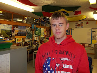
This is the image which I used as a base for the cover. Unfortunately the quality of the image was not fantastic and the lighting in which it was taken was unsuitable for photography. I aim to improve this in my future work.
This is a 3D masthead that I designed in Cinema 4D. It looked nice by itself but I do not feel that it suits the magazine cover that I created. I will have to bear in mind that I need to create more subtle and more fitting mastheads in my upcoming projects.


This is the front cover I created as a first attempt. I am very unhappy with it and shall need to dramatically improve my skills with cameras and the computer software if I wish to create a professional, sellable looking final product. To do this I shall need to practise far more so and to watch many tutorials so as to boost my talent.

Monday 18 February 2013

Preliminary Task Photoshoot


These are the pictures I took for the preliminary task. As is easily noticeable, very few were actually taken (eight in total). This was due to the limited time frame which we were given (during school hours between lessons) and unwillingness of students to have their pictures taken (I personally would have liked to have had at least thirty pictures to work with). Despite this, I believe that the pictures are of a good quality and will be more than satisfactory to use in the preliminary task (designing a front cover and contents page for a school magazine) due to the generic lack of professionalism in many available local magazines. Therefore I consider this photoshoot to have been a success.

Saturday 16 February 2013

School Magazine Cover Analysis


This is a basic educational magazine I have found. The key sections of its layout have been labelled (the puff, masthead, plugs and cover lines) so as to show its simplicity and identify where they can be found on the page.  The magazine itself is extremely simple and displays very little information on the cover, this is presumably because it a very small paper and very can only contain a limited amount of content. Adding to this, its target audience will be young children and their parents/guardians whom shall be unlikely to want to read an overly complex and large magazine. The photograph shown shows a group of students playing some sort of ball based game and represents the fact that the school is most likely a sporting specialist one, as indicated in by the main cover line ‘sports overview a successful year…’. The photograph seems to be of a high quality but contains either a minute amount of editing or none at all. However this is fitting for the genre as one would not expect such a thing for a magazine aimed solely at students and their guardians.