

(click to enlarge)


This is my layout plan for the double page spread. Although it looks simple and generic I believe that it will provide me with a fantastic, professional looking product. It is largely inspired by a variety of different existing content.
These are the main sources of my inspiration for this design:

The key features that I shall use from this magazine are the large quotes, position of the main picture and the separation of the title and short introduction paragraph.

My favourite feature in this double page spread is their title 'Slave to the rhythm' and its variation in size and positioning ('Slave' being far larger in size than 'to the rhythm' but taking up a similar width of the page). I am very likely to include a title similar this in my final double page spread. However, I am not to keen on their choice to place the story on the left hand side and the image on the right.

The verity of size and shape in the quote particularly draws my attention. I am unlikely to use something like this, but it certainly stands out and would therefore be worth experimenting with.

I admire the choice to continue the image from the first page onto the second. I will definitely use this tactic when producing my own double page spread. Another of the features I am considering is the large letter at the beginning of the story that uses a different font type to the rest of the text. In addition to this, the choice to use a blank background for the model is particularly interesting and is another feature which I am taking into consideration.

This is clearly a very professional magazine and I approve of the layout. However I hate the oversized, red L they have placed behind the text. I believe that it will detract the attention of the reader and generally causes a somewhat ugly and undesirable effect.

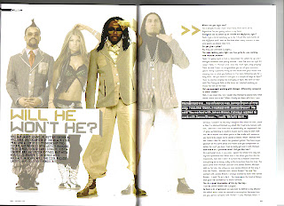
This cover looks very unprofessional due to the dark colours used and the bland expressions on the models. Despite this, I feel that that their layout of the text is very good therefore improving the feel of these pages dramatically.

The large quotes and continuation of the picture onto both pages are exceptionally good. However I am concerned that using such a small amount of text for the main story would reduce the quality of my double page spread.

The clear picture, large quote and clean layout are all very positive features of this example. The only thing which do not approve of is the image used in the top right section as I believe it was an unnecessary use of space; this space could have been used for an extra amount of article.

This example has a very nice picture. Unfortunately, the black boxes behind the text severely lessen the professionalism of this double page spread.
No comments:
Post a Comment