Despite the results of my survey, I decided to create all of the titles I had come up with in a high quality 3D format via the use of a piece of software called Cinema 4D (I also used this software as part of the creation of my practise preliminary cover, however it did not turn out as I had planned). I am very aware that this is unnecessary effort, but I have decided to do so because it shall improve my skill and will provide me with other options if I do not like what I create for 'Ephemera' (the title I planned to use)
Here is a video showing the creation process of my 3D titles and their rendering:
1) Here are my renders for the title 'Aether'. They look beautiful but I do not think they would be fitting for what I have plan on creating for my front cover.
2) These are the renders for 'Elixir'. The top design is my personal favourite out of the three. I am strongly considering using it in the front cover as it seems as though it would be very appealing to my target demographic. This is because it has a graffiti like feel to it, something likely to attract a large audience of young people as it is relatable to the urban environment and was widely publicised by London 2012 Olympic Games.
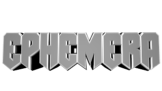
3) These are my two renders for 'Ephemera', the title which gained the most votes in my survey. Thankfully I am delighted my outcome of these renders as I feel they would look rather professional if used in a magazines front cover. I prefer the top render as it has a nicely contrasting colour palette than the bottom one and overall looks better. Adding to this, the render below seems too crime/gang related as its colours and font seem too similar to those of the logo of the popular television show 'Pimp my ride' (video link to their theme tune)
4) This is my render of the title 'Harbinger'. I shall not be using it as it looks as though it is intended for use in a heavy mental genre magazine, not the electronic dance music one I intent to create.
5) Here is the render of 'Nemesis'. I shall not be using this either as it seems to be far too cheap and tacky looking.
6) This is my render for 'Overture'. It looks hideous, boring and shall definitely not be used as the masthead for my magazine.
7) These are my 'reflux' renders, they are all fairly dull looking and shall therefore not be used in the creation of the final front cover.
8) This is the render I did for 'Paragon'. It looks exceptionally good but is unlikely to be used in the final product as the colours do not seem fitting for the genre.


No comments:
Post a Comment