Sunday, 14 April 2013

Evaluation Question 7

Looking back at your preliminary task, what do you feel you have learnt in the progression from it to the full product?

When I began my preliminary task I had relatively little experience using digital image editing software. Due to this, the cover that I produced contained main armature errors. The first of these errors was that I over edited the model. This caused the whole image to lose its sense of realism. Not only did it lack realism but it made the featured person look inhuman, therefore making it completely unsuitable for a school magazine. Another fatal flaw of mine was to include far too little text. The lack of text completely defies the conventions of magazines and gives a feeling that it is an unprofessional piece of work. In addition to this, my main feature ('New Uniform!') has absolutely no relevance whatsoever to the magazines image. The text implies that there is a new school uniform but the featured student is wearing an anorak, this will without a doubt cause massive confusion to any readers of the magazine. Finally, the covers sticker is far too large and provides very little to entice any potential customers ('win a £10 book voucher').


(my preliminary task front cover)


Due to the failings of my preliminary front cover I decided to teach myself how to use editing software properly and what various music magazines did to look so professional. Learning the basics of the software I was going to be using (Cinema 4D, Adobe Photoshop and CorelDraw Graphics Suite) was a long a difficult process. However I believe that overall it was definitely worth it, to teach myself how, I watched many video tutorials on Youtube (an extremely popular video sharing website) and read a verity of guides on the internet. I believe that my final front cover is vastly more professional that my preliminary task one and that it follows a greater amount of conventions. One of the key improvements was the larger verity of fonts. In my preliminary task I only used two different fonts (one for the masthead and another for everything else) where I used a total of four in my final cover (double the amount used in my preliminary task). My editing had greatly improved as well. In the final cover I was able to utilize three dimensional items, special effects, overlays and cutting to make my product unique and looking nice. I also learnt about a  range of magazine front cover devices such as mastheads, plugs, straplines, coverlines, puffs and barcodes, many of which I used in my final product.


(my final front cover)


My preliminary contents page was of a extremely poor level of design. It lacked in almost every aspect and was far too basic for its intended purpose. The only aspect which I consider myself to have done well in was to number the pages and keep the font similar to that of the preliminary front cover. I believe that I have learnt a great deal about magazine construction since I made this. Improvements which I have included in my final design include section titles, a greater amount of listed pages, a higher quality design of title, more pictures and various quotes.

(my preliminary contents page)


(my final contents page)


Overall, I  think that I have dramatically improved in magazine creation. I believe that my final products are of a high quality and would not look out of place on a stores shelf. This was acknowledged in the positive feedback which I received.

Evaluation Question 6

What have you learnt about technologies from the process of constructing this product?

Cameras:
I have become significantly better at using cameras since the start of this project. To begin with, I was taking poor quality  blurred and badly lit pictures. However after gaining experience from my various photoshoot attempts I was able to improve my talent. Now I am able to capture high quality clear shots which are well lit and look professional.


Adobe Photoshop:
To create the graphics for my magazine I used Adobe Photoshop. When I started the project my skills were very limited because I had previously only had a little experience with the software. Unhappy with what I was producing, I watched a verity of tutorial videos to improve my knowledge and skill. I am now able to create visually impressive pictures and was able to make a lovely looking set of final pieces.


Blogger:
Before this project I had never used blogger. To begin with I found it hard to use and therefore ended up with a poor layout. Adding to this, Google deleted my account for seemingly no reason whatsoever and I therefore had to start from scratch again. Fortunately though, this event only occurred within the first few weeks of the course. I as used Blogger more, I became increasingly better and was able to eventually create what I consider to be a professional looking blog.


CorelDraw:
Prior to the course I had never used CorelDraw Graphics Suite. I found the software to be extremely problematic on occasions as it would often freeze and become unresponsive when I tried to save any of my work. This resulted in the loss of many documents of mine. Luckily I was able to fix the problem. Once the problem had been fixed I used CorelDraw primarily to arrange the layout of many of my products. The software comes with editing tools but for the majority of my work I edited images using Adobe Photoshop.


Cinema 4D:
Cinema 4D is a three dimensional image making piece of software. I used it to create the various different three dimensional shapes and title that appeared in my work. At the beginning of the course, I was only able to create text based images. However, I taught myself via a range of video tutorials how to create abstract shapes and other objects. Examples of my three dimensional items can be seen in all of my final products.


Here is a video showing me creating a range of images and items, thus displaying my progression in skill using Adobe Photoshop and Cinema 4D throughout the course:


Here are all the different computer technologies that I used:

Evaluation Question 5

How did you attract/address your audience?

Front Cover-
On my front cover I attracted my audience via a veriety of techniques. One of these techniques
 was to Use visually impressive three dimensional graphics. These graphics are similar to that of many electronic music album artworks and are therefore recognisable to the audience. They are also lively, interesting and were made to be targeted at the teenage audience. Another way I attracted my audience was to have a fictional quote by the massively famous dubstep producer named Skrillex. Skrillex is so popular that the mere mention of his name would attract a mass of his fans.

Evaluation Question 4

Who would be the audience for your media product?


Age:
The intended audience was people between 13 to 25. My initial reason for selecting this age group was because I myself was between those age boundaries. This made the task of creating my magazine significantly easier as I already had a fair amount of knowledge about the magazine styles and genres being aimed at people of my age. In addition to this, the music genre which I chose to focus my magazine on (electronic music) has a very large young audience. I was able to observe this first-hand when I attended various electronic music festivals and concerts.


Gender: 
Female 40% and Male 60%, as I decided to refrain largely from focusing on a single gender. My initial intention was appeal 50/50 to both genders. However I believe that it would attract a slightly larger male audience as it contains a fairly excessive amount of energetic and masculine graphics. Also music magazines in general tend to have a greater focus on their male audiences. This can be seen in various magazines via females being over-sexualised so as to attract the male gaze.


Economic Group: 
My magazine was set to cost £1.99 so as to make it affordable to the lower and middle groups of wealth. These groups are significantly larger than the higher wealth groups and therefore are larger consumers of the electronic music genre magazines.


Musical Preference:
The musical preference of the audience of my magazine would be electronic music. In particular, my magazine is focused on the EDM side of the genre and would therefore attract an audience which enjoy that type of music

(picture of a DJ playing music to an audience)

Evaluation Question 3

What kind of institution might distribute your media product and why?

I believe that Wenner Media may distribute my media product. I say this because Wenner Media is responsible for publishing the Rolling Stone magazine. My magazine takes many of its elements from their magazine and they would therefore appeal to a similar audience therefore it would make sense to distribute them via the same company. Having my product distributed by such a large organisation would greatly benefit its circulation and fanbase.

Evaluation Question 2

How does your media product represent particular social groups?


My media product is aimed heavily at teenagers with a passion for electronic music. Due to this I had to make my magazine visually impressive, interesting and suitable for my genre (electronic music) so as to appeal to the niche market it is aimed at. Because the music is heavily associated with the club scene, I decided to make my magazine as lively as possible. I was able to achieve via using a variety of abstract three dimensional shapes and special effects (smoke, sparks, etc). These visually symbolise the passion and uniqueness of the music. Adding to this, similar graphics and effects are used by a variety of popular electronic music producers such as Skrillex, Deadmau5, Knife Party and Nero. As it is used by these massively influential people, the style will be very relatable to my targeted audience and therefore increase its saleability.
The product I have produced shall also appeal to mainstream media consumers as my model is wearing currently fashionable clothing items. Using fashionable clothing allows people to feel more personally involved with the magazine, as it gives them something to relate themselves to. Adding to this, a medium close up was used. The medium close up is very conventional of music magazines and thus adds an element of professionalism to the piece, thus reassuring the readers that the magazine is of a high standard. The shot being taken at eye level is also important, as it gives the impression that the musician is merely human. If the shot was taken from a low angle it would repel people as it would imply that the person in the picture thinks of themselves as being better and of a higher class than everybody else.

Evaluation Question 1

In what ways does your media product use, develop or challenge forms and conventions of real media products?


My final project pieces (the magazine front cover, contents page and double page spread) all use, develop or challenge forms and conventions of real media products. One of the most evident displays of this is in my front cover’s title. The name itself is fairly standard and sticks to the conventions as it is short and consists of a single, interesting word ‘Ephemera’. Many magazines use either two words or fewer, or an abbreviation for their magazine titles; some examples of this include: Rolling Stones, NME, Q, Kerrang and Vibe. Many of these titles hold very little meaning to anyone and are often there simply to give a brand identity as well as providing a simple hook (a short title such as ‘Vibe’ is far more likely to catch the short attention span of humans than something long in length e.g. ‘New South London Jazz and Blues Music Magazine’) and being memorable.

Defying traditional magazine conventions, I created a three dimensional title (using a program named ‘Cinema 4D’). I am currently unaware of any other magazine which done this, therefore making my magazine completely unique in the sense that it contains an aspect which none others have. The reason for making it this way was to intentionally defy conventions, therefore potentially boosting my magazines appeal to shoppers as they become curious as to why my magazines masthead is different to all the others, thus increasing the probability of them selecting and reading my product. However, I was able to make my masthead more subtle and appealing via using the common magazine trend of placing the featured model partially in front of the title. This is clearly shown here in my magazine and an old ‘NME’ extract:


('NME' masthead)


(my masthead)


The barcode I create is very typical of music magazines. It consists of a custom made barcode (created using: http://www.terryburton.co.uk/barcodewriter/generator/) with a two digit extension. In addition to this, I have included the price, date, issue number and website all of which are commonly found in high profile music magazines. However to make mine different to the majority of content and to link it to modern technologies, I added a QR code. QR codes (abbreviated from Quick Response Code) are codes which are scannable by many modern smartphones, when scanned they either redirect the user to a website or provide them with a small text based message. The potential for QR code use in magazines huge as they could be used for a variety of reasons such as: linking customers to their webpages, supplying them with exclusive deal codes and promotions, unlocking special website content and much more. To create the one on my front cover I used: http://qrcode.kaywa.com/. Here is my barcode and one from a 2008 ‘NME’ magazine:


('NME' barcode to the left, my barcode to the right)


Another use of conventions of real media products was placing my model in front of the front covers masthead. I had seen these technique used in a variety of different magazine including Q, NME and Kerrang. This method seems to bring a new depth to the magazine as it makes it appear as though the featured person is coming out of the magazine itself. In addition it allows a larger portion of the person to be displayed, thus increasing the likelihood that fans of the musician that is featured will notice and therefore buy the magazine. In my front cover I have tried to keep as much of the masthead visible as possible because my title ‘Ephemera’ is a very rarely used word. Below are examples of mastheads being partially covered by models:


(my front cover)

(Q magazine front cover)

(NME magazine front cover)

(NME magazine front cover)


In my contents page I decided to challenge the standard conventions and make the layout seem more like a promotional festival poster. The intention I had in mind when I chose to do this was to make the magazine appeal more so to festival goers by presenting them with a format which they are largely familiar with. However, I believe that I was still able to achieve the purpose of a contents page via including a variety of titles, page numbers and quotes. As well as this I have kept its colour scheme similar to the front cover and double page spread thus reinforcing the brand identity.


(my contents page)

(Download festival poster)

(Wireless festival poster)

(Global Gathering festival poster)


The models clothing is representative of the role models of my intended target audience. The clothes are currently highly fashionable and appeal greatly to the fashion conscious teenage audience. Similar clothing can be found on a verity of modern musicians, it sets the feeling that the wearer is professional but also largely casual. The jacket in particular is an extremely common fashion items in the industry, by many it could be seen as a statement of masculinity. Some musicians and bands that have been known to ware jackets include Knife Party, Muse, The Arctic Monkeys, Skrillex and Nero.


(my front cover with the model)

(Nero)

(The Arctic Monkeys)

(Knife Party)

(Skrillex)

(Muse)


Double Page Spread Construction Process Video


This video shows the separate stages of the construction process which I went through to create my final double page spread. The software used produce it was 'Adobe Photoshop Elements 8.0', 'Cinema 4D' and 'Corel Draw Graphics Suite'.

Contents Page Construction Process Video


This video shows the separate stages of the construction process which I went through to create my contents page. The software used produce it was 'Adobe Photoshop Elements 8.0', 'Cinema 4D' and 'Corel Draw Graphics Suite'.

Final Contents Page

(click to enlarge)

Contents Page Feedback

After finishing my contents page I requested feedback so as to gain a verity of responses that would help me improve the quality and professionalism of my creation. Here are the responses I received after sending my work to people:


"It looks like a good start, but could do with a lot of improvement. Perhaps shorten the 'interview' list to one column and give the other two different headings."
- Clayton Jones (Student)


"I love what you've done to the background. However it looks too disorganised and the 'PG's seem unnecessary. I recommend aligning it better and getting rid of those hideous 'PG's that seem to be all over the place."
- Lucy Tate (Student)


"Well... its better than anything I could make, but it looks slightly too messy for a contents page"
- James Ferdinand (Student)


"Incredible... nothing else to really say about it"
- Richard Scott (Student)


"You should really sort out the alignment, it seems far to amateur left as it is. Also those random 'PG's before the page numbers just seem like a waste of space. Maybe change the bottom segment as well whilst your at it... seems silly to have so many interviews."
- Gregory Bates (Student)

This feedback has been brilliantly insightful and will definitely help me to dramatically improve my contents page and thus the overall quality of my magazines design. I shall begin working on these changes as soon as possible.

Contents Page Before Feedback

(click to enlarge)

This is what I have created so far for my magazines contents page. Personally I believe that it is the weakest of the three pieces I have created so far and will thus ask for people feedback on how it looks so far and how I could possibly improve it.

Double Page Spread Feedback

Upon completing the construction of my double page spread I requested a group of people to review what I had created and thus supply me with any feedback needed to improve my project. These are the responses which I received from people.


"Wow! This is crazily good! Personally I don't see any need for change."
- Thomas Baker (Student)


"I really liked how you made the image continue over both pages of your magazine. Lovely, clear layout as well."
- Arnold Thomson (Student)


"Gorgeous use of graphics. Would love to know how you made it."
- George Mills (Student)


"Haha those 3D shapes are absolutely incredible!"
- Amy Hanson (Student)


Seeing as non of the feedback which I received pointed out any negative aspects I have decided not to change my double page spread at all.

Final Double Page Spread

(click to enlarge)

Saturday, 13 April 2013

Magazine Double Page Spread Text Content


Fresh from his series of five completely sold out gigs from his ‘Blitzkrieg in Berlin’ show hosted at the Olympic Stadium, Berlin, DJ Ennui discusses backstage life, music and his upcoming ‘Takeover Tour’ with our journalist Sonny Moore. Brace yourselves for the thrilling untold true story of the man behind the mask.


What started your passion for music?

I’ve had this passion for as long as I can remember. However, I think the spark that lit the fuse for my love of music was definitely the moment my father bought me a flute for Christmas.


A flute? EDM is quite the opposite, wouldn’t you agree?
Well it’s funny you should mention it – I had classical training for two years and I think the influences are clear in my early material as well as my more recent content. However I quickly became known as ‘Flute Boy’, and eager to shake the newfound identity, I used my pocket money to buy an early version of FL Studio and hence began to dabble in Electro Swing and EDM, purely to impress my friends, and to dispel the bullies. Soon my life revolved around the creation of electronic music, and I was soon scouted by the prestigious Mau5trap record label… but playing the flute is still my guilty pleasure!


That’s quite a story – how did you enter the live music scene?

You won’t believe this! I began by turning up to friend’s birthday parties with my Dell laptop and a shoddy speaker, and trying to blag girls with my music. I can tell you now that it didn’t work – I guess girls simply weren’t overwhelmed by my amateur beats and disappointing drops – however it allowed me to spread my music to a larger audience, gain publicity on MySpace, and receive the feedback I so desperately needed to improve my work. Soon after I applied for larger venues in my local area on Friday nights, and became a local sensation.


Do they compare at all to the monstrous five gigs you have just played in Berlin?

Certainly not! However nothing can compare to that one night in a dimly lit Brixton chip shop… But we’ll not delve into that.


So, why conceal your face to the public?

Quite honestly, I don’t believe I have the answer to that question – it’s just the way things turned out – on the other hand, it certainly has its perks.


And what would those perks be?

I simply feel that it gives me so much freedom because I am able to live a double life – one of peace and tranquillity, and another of parties and publicity. For me, I maintain a perfect balance of the two. For example, I can dedicate time to my Chelsea Pensioners extreme bingo club with relative anonymity, while retaining my reputation as a global party animal. It’s truly unbelievable. If you are struggling to visualise my lifestyle, I would strongly recommend watching ‘Hannah Montana’ on the Disney Channel.


Simply amazing! Let’s discuss your upcoming global ‘Takeover Tour’

Ah yes, I am touring exactly thirty two separate countries in six continents (Sorry, Antarctica), but personally I am most excited about the Gulf of Mexico section of the tour, as it involves a world exclusive two day long aircraft carrier gig between Mexico and America, and although I regret to give away no spoilers, my entry to the gig will be ‘pure gold’, as they say.


And will you be visiting the UK during your tour?

Why of course, how could I miss it? As well as being my home country of course, it is also my favourite place to gig, and in addition I am scheduled to be granted a knighthood the day of my O2 Arena gig!


Wow, we all look forward to it! And when will tickets be available?

Tickets are available from midnight, April 1st 2013 to May 20th, however I would advise ordering as early as possible since my last tour sold out completely literally minutes after the tickets became purchasable!


Thank you so much for talking to us, DJ Ennui. Make sure to pick up a copy of his new album, ‘Balloon Party’, on sale everywhere right now, and also continue on to page 32-33 for info about specific venues, dates and support acts for the gargantuan global ‘Takeover Tour’, as well as exclusive content with the hottest EDM acts on the scene TODAY.
  

Double Page Spread Layout Plan And Research

(click to enlarge)


This is my layout plan for the double page spread. Although it looks simple and generic I believe that it will provide me with a fantastic, professional looking product. It is largely inspired by a variety of different existing content.

These are the main sources of my inspiration for this design:

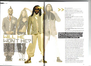
The key features that I shall use from this magazine are the large quotes, position of the main picture and the separation of the title and short introduction paragraph.


My favourite feature in this double page spread is their title 'Slave to the rhythm' and its variation in size and positioning ('Slave' being far larger in size than 'to the rhythm' but taking up a similar width of the page). I am very likely to include a title similar this in my final double page spread. However, I am not to keen on their choice to place the story on the left hand side and the image on the right.


The verity of size and shape in the quote particularly draws my attention. I am unlikely to use something like  this, but it certainly stands out and would therefore be worth experimenting with.


I admire the choice to continue the image from the first page onto the second. I will definitely use this tactic when producing my own double page spread. Another of the features I am considering is the large letter at the beginning of the story that uses a different font type to the rest of the text. In addition to this, the choice to use a blank background for the model is particularly interesting and is another feature which I am taking into consideration.


This is clearly a very professional magazine and I approve of the layout. However I hate the oversized, red L they have placed behind the text. I believe that it will detract the attention of the reader and generally causes a somewhat ugly and undesirable effect.


This cover looks very unprofessional due to the dark colours used and the bland expressions on the models. Despite this, I feel that that their layout of the text is very good therefore improving the feel of these pages dramatically.


The large quotes and continuation of the picture onto both pages are exceptionally good. However I am concerned that using such a small amount of text for the main story would reduce the quality of my double page spread.


The clear picture, large quote and clean layout are all very positive features of this example. The only thing which do not approve of is the image used in the top right section as I believe it was an unnecessary use of space; this space could have been used for an extra amount of article.


This example has a very nice picture. Unfortunately, the black boxes behind the text severely lessen the professionalism of this double page spread.


Contents Page Layout Plan And Research

(click to enlarge)

This is my layout plan for the contents page that I am creating. I intend to make it look like a slight cross between a traditional contents page and a promotional poster for a festival. This I believe is a very unique and original idea, however it shall be very difficult for me to pull off successfully. Although if I am able to do what I intend to then I feel that the result will be wonderful, as well as establishing a strong connect between the magazine and various festival attendees . In order to even attempt to do such a thing I have been looking through a variety of different contents pages and festival posters.
These are a few of them:


This is contents page from a 'Glamor' magazine. It is very reflective of my intended design as it has a very large title and date at the top of the page. As well as this, I like the idea of repeating the magazine's name in the contents page so as to reinforce the brand identity. The picture of the woman used is very good as well. However I do not intend to have a single large image, instead I will have a variety of pictures all with quotes and brief summaries of their own.


My favourite feature of this contents page is the large bold text used for the different sections of the magazine (in this example they are: news, radar, reviews, live!, features). I will definitely be using a sizeable font for my section dividers.  


I love this design. It is likely that final product shall be of a similar feel to this, but have fewer pictures and feature a greater amount of featured pages. In addition to this, I do intend to place any adverts in my contents page as I believe it will waste space and give it a feeling of cheapness and a lack of professionalism.


The feature that seems most appealing to me in this magazine is the use of page numbers over the featured photographs. I intend to use this tactic in my final product but use a font and style similar to that of my front cover so as to give it a consistent feel.


I have already shown a NME contents page but I feel that this one gives a very different feel to the previous one. This has been done via the change in colour palette, difference of page heading and photographs used. The previous contents page had a very serious 'rock' music theme, but this one seems far more light-hearted and festive themed. I will need to remember that these variations can  be made, if I am ever to produce another one of these magazines.


This is a promotional poster for the 'Global Gathering' festival. Although its fonts are far to varied to be used in a contents page I particularly like how they've created the page heading. I am likely to try to replicate the feeling of this heading in my final contents page.


This is the promotional poster for the 2012 'Download' festival in Donington. As I mentioned in the example above, I am very interested in producing a title similar to those seen in festival posters.


Here is the promotional poster for the 'Wireless' festival 2013 in London. I admire how they have set out their line up sections and am likely to attempt to replicate this when creating my different sections (e.g. interviews, reviews, festivals).


Front Cover Construction Process Video


This video shows the separate stages of the construction process which I went through to create my final front cover. The software used produce it was 'Adobe Photoshop Elements 8.0', 'Cinema 4D' and 'Corel Draw Graphics Suite'.
What can be seen in the video (in order):

1) The original photo which was used to produce the cover

2) The background has been cut out of the picture

3) Abstract 3D shape used to obscure the models face

4) Shade and background images added

5) Visual effects applied (smoke, fire, sparks, cracks and flare)

6) 3D masthead added at top of page

7) Custom made splatter effect and overlay for the title applied

8) 3D main cover line text placed over splatter effect

9) Strapline, Cover lines, Puff and other text added

10) Barcode with price, date, issue and fake copyright information placed

Final Front Cover

(click to enlarge)

Friday, 12 April 2013

Font Cover Feedback


After completing my final front cover I asked some people for feedback on it. This was done so as to identify whether there were any major errors with it that needed to be fixed and to see if the general reaction to it was positive or not. These are the responses that I was given:


“Haha I love it.”
- Micah Hills (student)


“Looking good! It is hard to make out the information next to the barcode however. Also it may help changing the 'featuring' to another musicians name as the magazine is already obviously featuring them via placing them on the front page.”
-John Glasspool (student)


"It clearly captures the type of music you were going for. It also reminds of gaming magazines in a way, largely due to the use of 3D graphics."
- Alex Anderson (student)


“Ohh cool! Well I really like the editing. The bits where you used cinema 4D are great, especially the logo and Joe's face. The artists you featured are great too.”
- Kieran Brown (student)


“I think that the editing looks brilliant, but you should fill in the top right corner with text or something because it looks empty and bland so far. Also, adding emphasis to the ‘And many more’ section could really improve it.”
-Benjamin Cook (student)


The most constructive views of the feedback were from Benjamin Cook. All of the point that he made were very valid and I shall include them in my finished product. These changes that I am going to be making are to add some text to the top right and to add an exclamation mark to 'And many more' as well as increasing its font size. In addition to this I have decided to take the advice of John Glasspool and change the barcode and 'featuring' parts of my magazine.

Front Cover Before Feedback


This is what I have created so far. Before releasing the final version of my front cover I shall be asking for peoples opinions on my magazine and whether or not it needs improvement.

Thursday, 11 April 2013

Software Practise


Here is a video that I have created. It shows my practise and progression in using 'Cinema 4D' and 'Adobe Photoshop' (the software I am using to create my final pieces). The reason I did these practises for was to improve my graphical talents and therefore increase my ability to produce a professional quality magazine.

Audience Survey

To determine what I should include and focus on in my magazine's font cover, contents page and double page spread I created a survey with the website 'SurveyMonkey' (website link: http://www.surveymonkey.com/). I used this method so that I would be able to instantly distribute it to many people virtually, thus saving time and paper by doing so as well being able to reach a far larger amount of people than I would have been able to by going around and doing it physically. The reason I created the survey was to give me an insight into various properties of an audience. The questions asked were:


1) What is your gender?

Male
Female

2) How old are you?

0-12
13-20
21-30
31-40
41+

3) How often do you buy music magazines?

Never
Very rarely (once or twice a year)
Occasionally (monthly)
Often (weekly)

4) How much would you spent on a music magazine?

Nothing
£0.01 - £1.00
£1.01 - £2.00
£2.01 - £3.00
£3.01+

5) Do you ever read music magazines via computer or mobile phone?

No
Yes

6) Do you ever listen to electronic music?

Yes
No

7) What is your favourite genre of electronic music?

Dubstep
EDM
Trance
Drum and Bass
Electro
Speedcore
I do not listen to electronic music

The reason these were asked was so that I would be able to craft my magazine to better suit the audience and their desires, as well as identifying whether or not I should include some features such as a website link and allow me to make small changes like changing the sale price.

Here is screenshot of the survey that I sent out:


After sending out my survey (I mostly sent it to people I have listed as 'friends' on Facebook, and to people I have added in my email contact list) until I had thirty responses I was left with these results (number of results in brackets):

1) What is your gender?

Male
(18 males)
Female (12 females)

2) How old are you?

0-12 (0)
13-20 (27)
21-30 (2)
31-40 (0)
41+ (1)

3) How often do you buy music magazines?

Never (5)
Very rarely (once or twice a year) (11)
Occasionally (monthly) (8)
Often (weekly) (6)

4) How much would you spent on a music magazine?

Nothing (3)
£0.01 - £1.00 (7)
£1.01 - £2.00 (14)
£2.01 - £3.00 (6)
£3.01+ (0)

5) Do you ever read music magazines via computer or mobile phone?

No (19)
Yes (11)

6) Do you ever listen to electronic music?

Yes (21)
No (9)

7) What is your favourite genre of electronic music?

Dubstep (4)
EDM (8)
Trance (1)
Drum and Bass (6)
Electro (2)
Speedcore (0)
I do not listen to electronic music (9)


These results most importantly show that I should price my magazine between £1.01 and £2.00 (I shall probably set its price to £1.99), that I should add a website link and that the main focus of my magazine should be on the EDM genre of music.

Wednesday, 10 April 2013

Fourth Photoshoot


These are the pictures which I took for my fourth photoshoot. These pictures were taken in an outside environment using a high quality camera. The natural lighting (the natural light provided a far better contrast effect than the pictures I had taken inside buildings) and backdrops provided me with excellence results and allowed me to capture clear and professional looking results. This time I was able to take many photographs and capture an extremely wide verity of poses, which will be extremely useful for creating my contents page and double page spread. With a bit of editing, I truly believe that some of these pictures shall provide me the opportunity to make a truly fantastic looking final product for my magazine.

These are some of my personal favourites taken in this photoshoot:

(nice artistic looking lighting on the model)

(model's face is hidden thus adding emphasis to my choice in the front cover to hide his face)

(distant and vague looking expression, may be seen as artistic or 'indie' to some)

 (shows two band members posing and looking serious)

(high quality photograph that looks as though it would be suitable for use as an album cover)

(innocent and likeable appearance of model, added to by the heart shaped piece of graffiti)

(action shot of jump pose, shows passion and celebration)

(stylish and unique pose, also showing similar clothing to 'Daft Punk')